Wayfinding in Corporate Offices in Malaysia: How Signage and Spatial Logic Improve Visitor Experience
Clear navigation is more than signage—it is a strategic part of office design that shapes first impressions, accessibility, and operational flow. This article explains how Malaysian corporate workplaces can use spatial logic and branded wayfinding to make every arrival feel seamless.
Navigating a new physical environment can often induce a subtle but pervasive sense of anxiety. For a guest arriving at a towering corporate building in the heart of Kuala Lumpur, the journey from the street to the intended meeting room is filled with micro-decisions. Where is the main lobby? Which lift bank goes to the mid-zone floors? Is this the right reception desk? When a workspace is designed with clear, intuitive wayfinding, these questions are answered before they are even consciously asked. Modern wayfinding relies on a rich combination of spatial layout, visual cues, architectural anchors, and judicious signage to guide people effortlessly. It is an unseen hand that directs traffic, reinforces brand prestige, and ultimately defines the user experience from the moment they step through the door.
Why Wayfinding Matters in Today’s Corporate Offices
The post-pandemic evolution of the workplace has fundamentally changed how offices are used. In today’s corporate environment, hybrid work models mean that even regular employees may not be in the building every day, while an increasing number of freelancers, consultants, and clients come and go. As a result, the workplace sees a much higher volume of people who are unfamiliar with the layout and need to quickly self-orient without relying on a traditional receptionist-led handover.
Effective wayfinding matters because it eliminates the friction of arrival. When people are forced to wander, ask for directions, or backtrack, it chips away at their confidence and the company’s professional image. Beyond mere convenience, wayfinding is a critical operational tool. A carefully considered navigational strategy ensures that meetings start on time, security protocols are respected, and front-of-house staff are not overwhelmed with simple directional queries. In the high-stakes environment of corporate Malaysia, where first impressions can make or break a business relationship, ensuring that a guest feels deeply anticipated and effortlessly guided is a non-negotiable aspect of premium office design.
The Visitor Journey Begins Before Reception
A strong wayfinding scheme starts long before the physical signage board inside the office space. True navigation considers the entire arrival sequence. In premium Kuala Lumpur offices, the most successful visitor experiences stem from a clear, uninterrupted progression from the building lobby, to the lift core, and finally to the tenant destination.
This journey often begins digitally with pre-arrival instructions, guiding a visitor to the correct parking zone or transit link. However, as they enter the physical space, the transition from public to private areas must visually “tell” them where they are. This can be achieved through subtle shifts in the environment. The flooring might transition from a polished lobby marble to a warmer, textured wood at the corporate entrance. The lighting could shift from bright and utilitarian in the lift corridors to a more focused, atmospheric glow as one approaches the reception. By using sightlines and ceiling treatments to naturally draw the eye toward the intended destination, designers create an arrival sequence that feels entirely instinctive, removing the immediate need for printed signs.
How Spatial Planning Shapes Intuitive Navigation
If a space requires an excessive amount of signage, it often points to a failure in spatial planning. The most useful modern architectural approach involves designing a floor plate that behaves like a map on its own. Increasingly, corporate designers in Malaysia are moving away from organizing spaces purely by department names, which means little to an outside visitor, and instead incorporating a concept of zoning by behavior.
By separating focus zones, collaborative spaces, social hubs, and learning areas, designers provide different visual cues based on the activity designed for that space. For instance, Malaysian office interiors are increasingly borrowing design cues from the hospitality sector rather than relying on traditional corporate formality. Guests are welcomed by softer lighting, lounge-like waiting areas, warmer materials, and café-style destinations. These environments help visitors orient themselves intuitively. When a visitor spots a lively, café-style pantry, they instantly recognize it as a social or waiting area, significantly reducing the "am I allowed to be here?" hesitation that often makes guests freeze in rigid, highly structured office layouts.
The Role of Signage in Reducing Friction
While spatial logic provides the foundation of intuitive navigation, physical signage remains an essential tool for reducing friction at critical decision points. The primary role of signage is to deliver the right information exactly when a user must make a choice—such as at corridor intersections, lift lobbies, or the branching pathways of large open-plan floors.
Good signage operates in the background, only pulling focus when required. It should feature a highly legible hierarchy of information, pointing first to primary destinations (like Receptions or Main Boardrooms) and then to secondary zones (like specific project rooms or restrooms). The wording should be concise, relying on universally understood terminology rather than confusing internal corporate jargon. When implemented with discipline, a reliable signage system acts as a comforting safety net for visitors, providing continuous reassurance that they are walking in the right direction.
Brand-Consistent Wayfinding Without Visual Clutter
A well-executed wayfinding system should naturally reinforce a company’s brand and professionalism, but catching the visitor's eye should never devolve into decorative noise. A common challenge in corporate branding is the temptation to plaster logos and aggressive brand colors on every available surface in an attempt to make an impact. Instead, the smartest offices use their brand identity in restrained, highly strategic ways.
Subtle but deliberate integration—such as adopting a unified color-coding system, using a custom icon family, or implementing a naming system for meeting rooms that reflects local Malaysian culture or the company’s core values—can seamlessly embed the brand into the space. A few memorable visual anchors, like a striking piece of artwork at a major corridor junction, serve dual purposes as both brand expressions and navigational landmarks. Conversely, overdesigned graphics, complex typography, and jarring color palettes can make a workplace feel visually chaotic and actually reduce spatial clarity, masking the very directional cues visitors are desperately looking for.
Digital Directories, Floor Graphics, and Environmental Cues
The modern workplace has transitioned from viewing “signage as a label” to treating “wayfinding as an interconnected system.” Today, companies combine physical cues with digital directories, QR-based check-in portals, and dynamic screens to cater to fluid, hybrid work environments. Interactive digital directories stationed at lift lobbies allow guests and roving employees to search for specific people, meeting rooms, or hot-desk zones before setting foot in the main office area.
Floor graphics and environmental cues are equally important, though they require careful consideration in the local context. For Malaysian offices, climate and maintenance are intrinsic parts of wayfinding design. High humidity, intense afternoon glare, and heavy tropical rain mean that reception areas and corridor finishes must be highly resilient. A digital screen placed opposite a west-facing window will become unreadable from glare, defeating its wayfinding purpose. Similarly, floor visual markers and material transitions near entrances must resist dirt, wear, and wet footprints so that the navigational cues do not become visually lost or permanently degraded over time.
Accessibility and Inclusive Navigation in Office Design
Accessibility must never be treated as a mere afterthought or a box-ticking compliance issue; universal design improves wayfinding for absolutely everyone. A space that is easy to navigate for a person with a visual impairment or mobility challenge is inherently easier for a stressed visitor rushing to a meeting.
In practice, inclusive navigation means specifying high-contrast signs where the text pops clearly against its background, utilizing highly readable, sans-serif typography, and ensuring logical placement at eye level at every major decision point. It also involves integrating tactile cues, such as Braille, and auditory signals where necessary to support diverse needs. Furthermore, accessibility dictates that circulation paths and corridors be wide and unencumbered. This makes the route obvious and comfortable for older visitors, courier and delivery staff, wheelchair users, and large groups of employees moving through the space simultaneously.
Common Wayfinding Mistakes in Malaysian Office Fit-Outs
Despite the best intentions, several common wayfinding mistakes consistently plague local office fit-outs. One of the most recurring errors is the phenomenon of the hidden reception. Often born from a desire to create a trendy, boutique feel, designers might bury the reception desk behind slatted partitions, dense planter boxes, or massive branded screens. While this might look dramatic and moody in a 3D architectural render, in reality, it obscures the first critical decision point. When a visitor steps out of the lift and cannot immediately lock eyes with a welcoming face or a clear reception marker, confusion sets in, placing unnecessary pressure on security and front-of-house staff to act as human signposts.
Another frequent pitfall is the over-ambitious feature wall that blocks sightlines into the rest of the office, creating a claustrophobic maze rather than an open, legible environment. Unclear zoning—where collaborative areas blend indistinguishably into quiet focus zones without any visual demarcation—further disorients users, making it impossible to deduce the intended behavior of a space simply by looking at it.
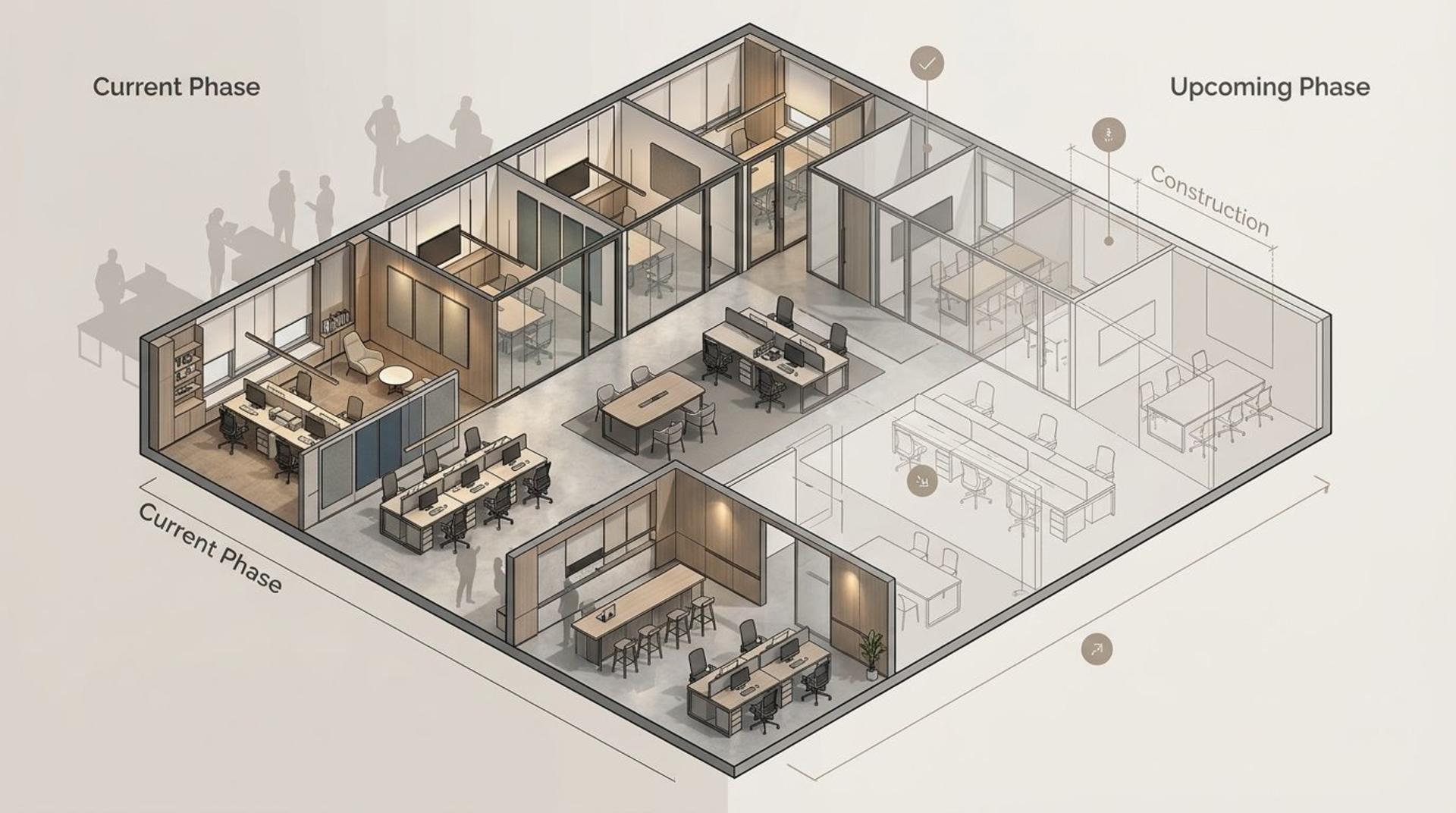
Designing for Multi-Tenant and Large-Scale Office Environments
In Malaysia’s expansive business districts, companies often operate within massive multi-tenant mega-towers. Designing for large-scale environments requires a specialized approach, as the visitor experience involves transitioning across the jurisdiction of different property managers and corporate tenants.
Wayfinding here must bridge the gap smoothly. The handover from the landlord’s monolithic base-building signage to the tenant’s personalized entry must be frictionless. If a visitor follows a sleek, minimalist brass signage system in the main building lobby, they should not be violently jarred by an entirely contradictory, confusingly labeled system the moment they step off the lift on the 25th floor. Large-scale environments demand high-level spatial anchors—such as distinct architectural features at the north and south wings of a building—so that visitors can maintain their geographical bearings even deep within a sprawling, multi-tenant floorplate.
How Better Wayfinding Improves First Impressions and Operations
An investment in superior wayfinding pays dividends far beyond aesthetics; it fundamentally acts as an operational enhancement. Consider the operational drag in an office with poor navigation: receptionists spend a significant portion of their day pointing to the restrooms, employees are constantly interrupted by lost visitors, and meetings are delayed because guests cannot find the right boardroom.
Better wayfinding eradicates these operational bottlenecks. When a guest arrives, easily locates the digital check-in, seamlessly finds the waiting lounge, and visually understands the path to their meeting room, the psychological impact is profound. They feel respected, relaxed, and secure. This seamless experience unconsciously elevates their perception of the company. It signals that this is an organization that values clarity, respects people's time, and pays meticulous attention to detail—attributes that align perfectly with premium brand positioning.
Key Questions to Ask Before Planning an Office Wayfinding System
To ensure a new office fit-out or a workplace renovation handles navigation successfully, project managers and business leaders should ask the following critical questions before the design phase concludes:
- Is the arrival sequence obvious? Step into the shoes of a first-time visitor. From the moment the lift doors open, is it immediately clear where to go, or is the reception desk hidden behind architectural features?
- Does the spatial logic do the heavy lifting? Are we relying too much on arrows and printed signs, or do the lighting, flooring, and ceiling treatments naturally draw people toward key destinations?
- Have we zoned by behavior? Do our focus, social, and collaborative areas look and feel distinct enough that a visitor intuitively knows how to act in each zone?
- Is the visual branding restrained and helpful? Are we using our brand colors and logos to clarify the space, or are they creating visual clutter that distracts from directional cues?
- Are we utilizing modern technology effectively? How does our physical wayfinding integrate with pre-arrival digital instructions, QR check-ins, and flexible digital directories for hybrid workers?
- Is the design truly inclusive? Have we ensured that contrast, typography, placement, and path widths accommodate everyone, including those with physical or visual impairments?
- Have we accounted for localized wear and tear? Will our floor graphics, entrance materials, and digital screens survive the realities of high humidity, afternoon glare, and wet tropical weather?
By addressing these questions, corporate workplaces in Malaysia can craft an environment where spatial intelligence and strategic signage work in perfect harmony. The ultimate goal is to create an office that feels effortlessly legible—a space that welcomes, guides, and reassures every individual who walks through its doors.